
Sempervirens Trädgård | Brand Identity and Web Design
Sempervirens Trädgård is the passion project of Sofie Nilsson, a trained gardener dedicated to designing environmentally sustainable, personalized gardens and green spaces that flourish over time. Guided by her clients' visions and the unique conditions of each location, Sofie creates spaces that balance beauty with longevity, not only for the clients but also for essential organisms like pollinators and soil microorganisms, ensuring a living, evolving ecosystem that balances aesthetics with long-term sustainability.
I am truly delighted with Katarina’s work and would highly recommend her to anyone in need of web design, branding, or other creative services. She is professional, attentive, and highly skilled at transforming ideas and visions into polished and compelling designs.
Sofie Nilsson – Founder, Sempervirens Trädgård
About
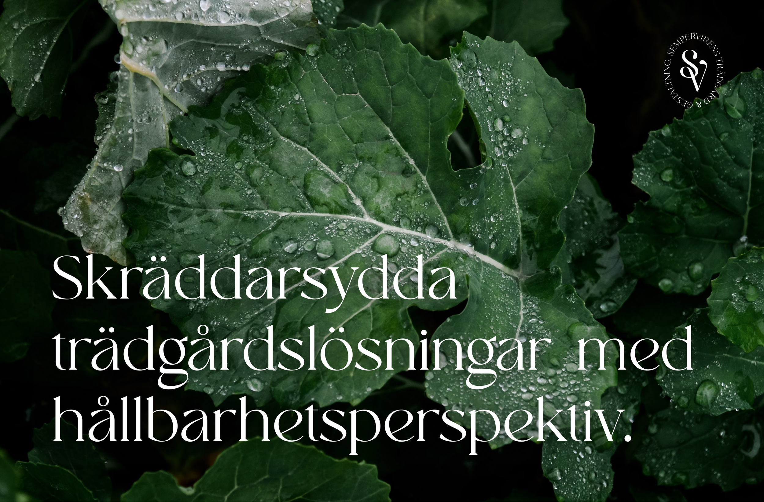
As a newly established company Sempervirens had a need for a visual identity that reflects its values and unique offer to the customer as well as a platform for customers to learn more about Sofie and the company and get in touch about potential gardening projects.
The project was carried out in close dialog with Sofie and included the development of a brand strategy as well as a visual identity including logo design, colour palette, typography, and illustration style. Additionally, a website that reflects Sofie’s holistic approach to garden design was created in to serve as the company’s main digital platform.
Brand Identity
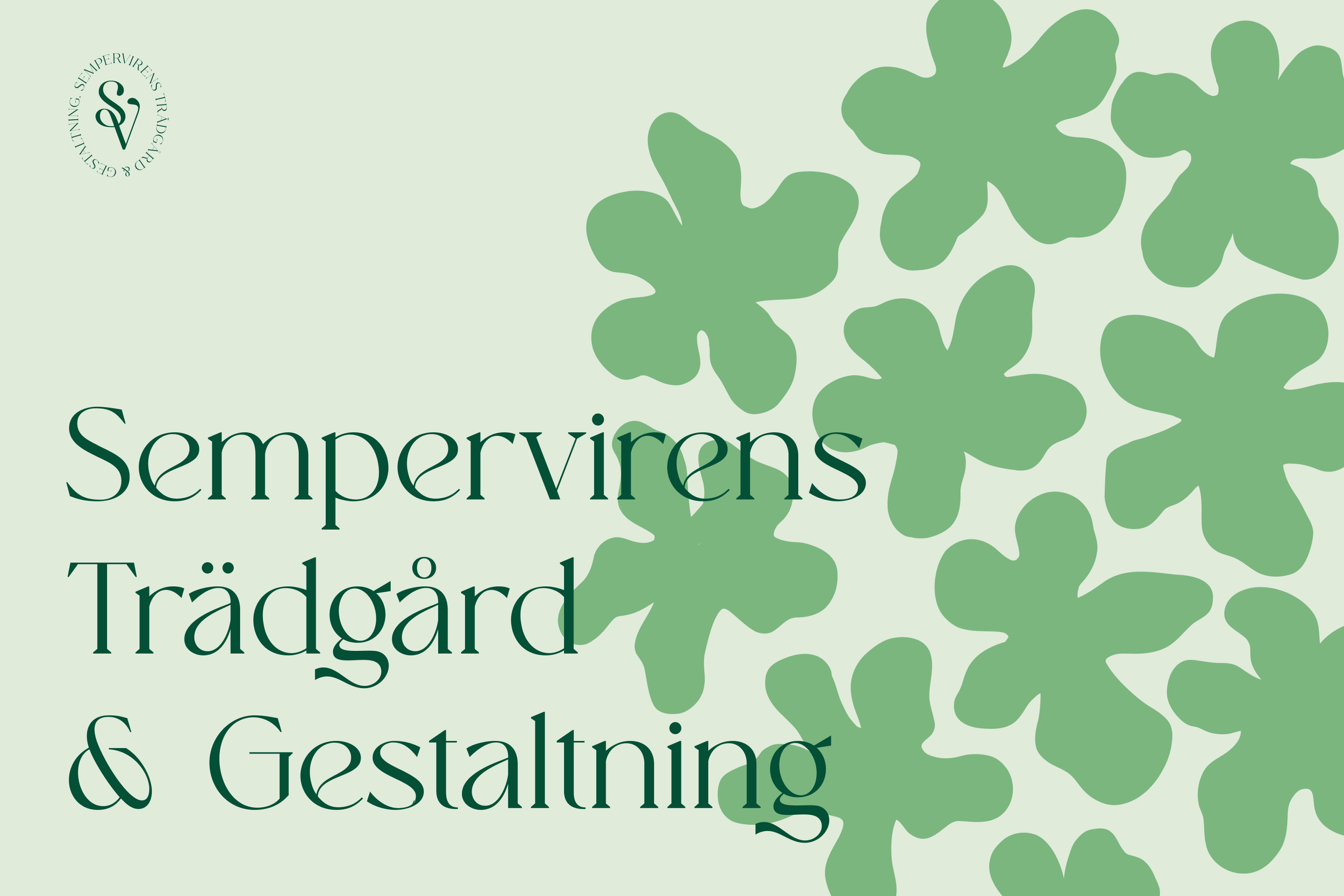
Sempervirens Trädgård is rooted in craft, patience, and a close relationship with nature. Its visual identity carries the same balance Sofie brings to her work: beauty paired with usefulness, warm and open-handed without losing rigour — an approach that listens closely to what each client and each plot of land actually needs, and takes that seriously, while still enjoying the process.
The visual language that follows was built to hold both sides of that at once: something considered and handmade-feeling, personal enough to reflect one person's practice and eye, with room left for warmth and play.
Logo Design
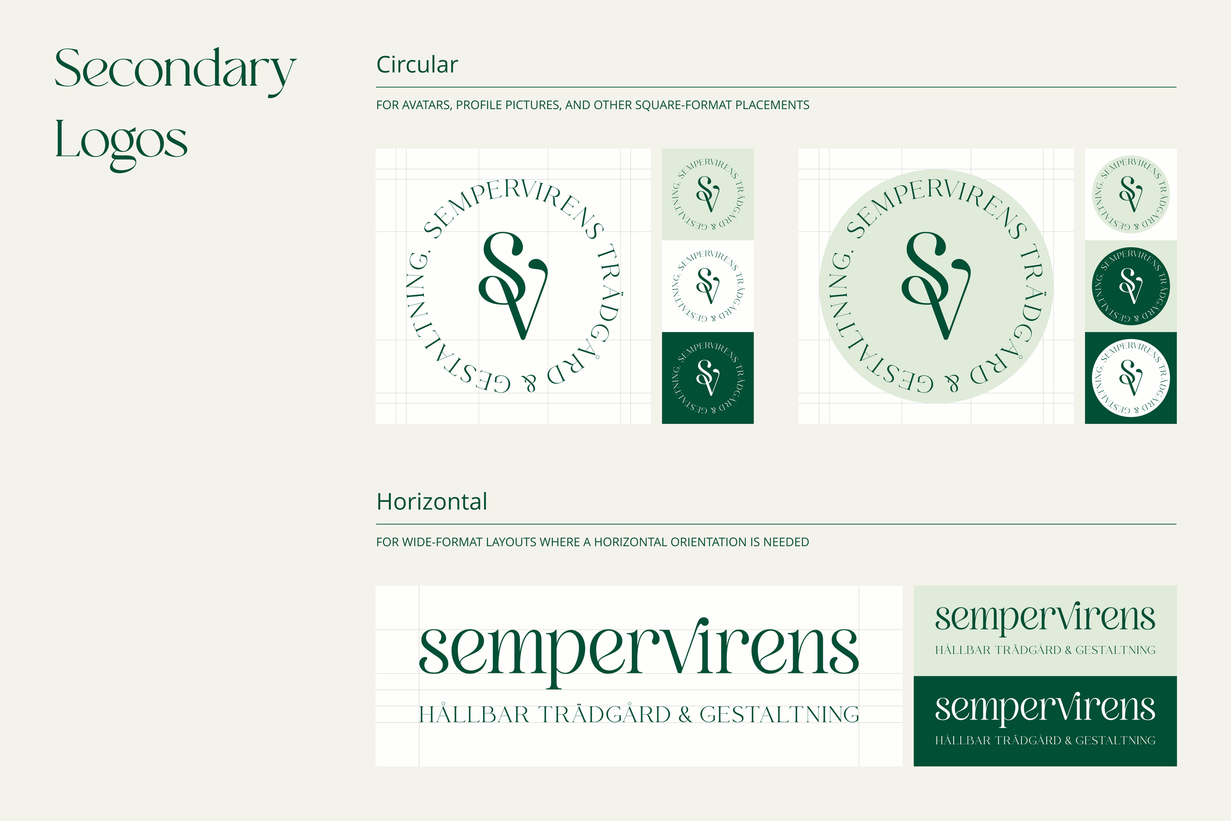
A small family of logos was created to cover Sempervirens across different formats. The primary logo pairs a monogram, an interlocking S and V drawn with the same swirling, botanical line that runs through the identity, inside an oval, stamp-like form with circular text tracing its edge, reading closer to a wax seal or a maker's mark than a standard logo lockup, as a nod to careful craftsmanship and trade.
A fully circular version was developed for social platforms and other formats that call for a round crop, and a horizontal wordmark-led version exists for spaces too narrow for the oval.
Colour Palette
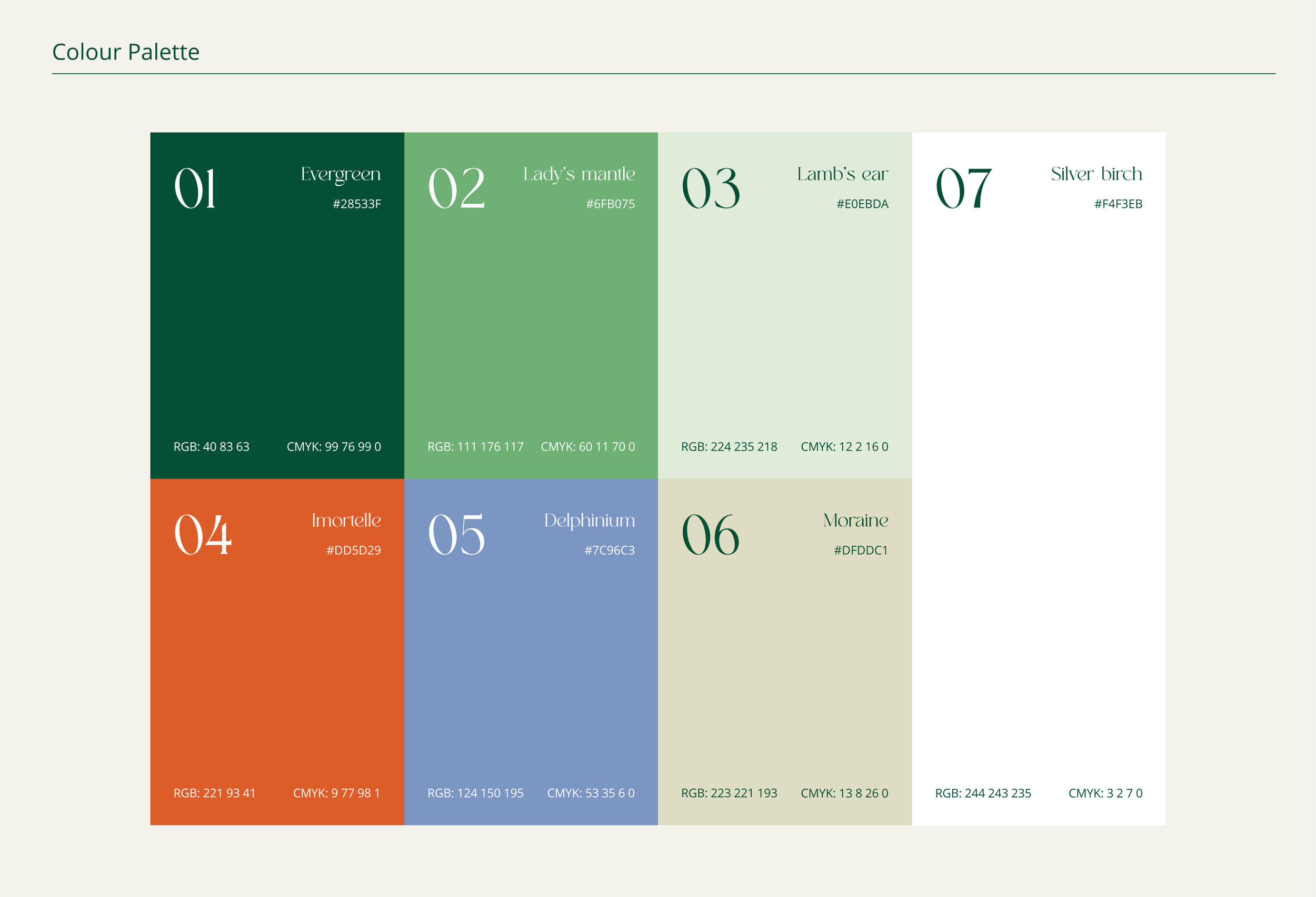
The palette centres on a deep forest green, paired with a soft sage and a warm off-white — the core trio that carries most of the brand's communication and sits behind Sofie's photography across the website.
Alongside these, a small set of more saturated accents brings in contrast and energy for illustration and layout details. The muted tones carry the brand day-to-day, and the brighter accents are used deliberately to create a dynamic palette.
Typography
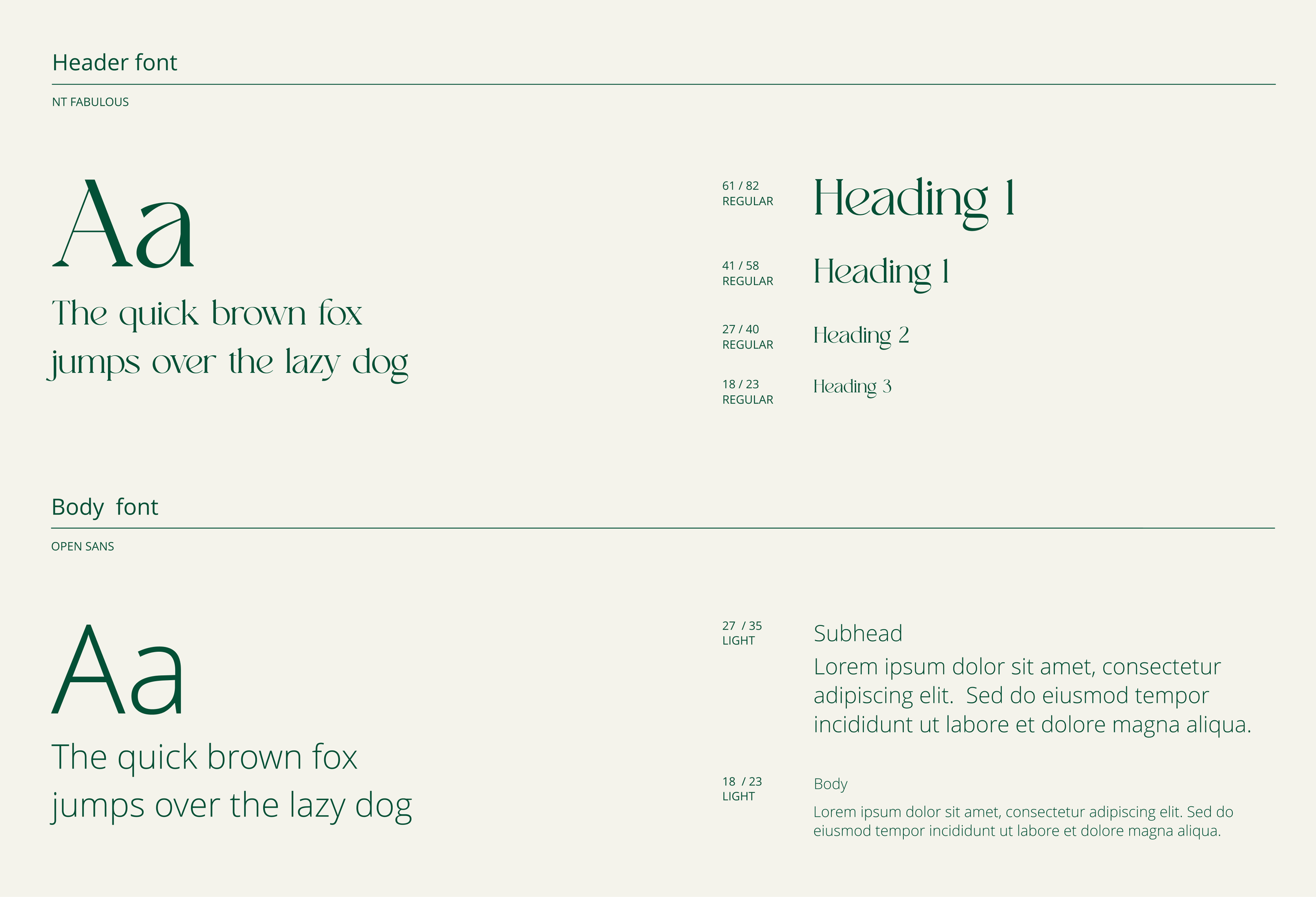
Headlines are set in NT Fabulous, a serif with the same soft, organic character as the logotype, and an alternative cut of the same face is used sparingly where the brand calls for something more expressive.
Body text runs in Open Sans Light — a plain, highly legible sans that steps back and lets the display type do the talking. The pairing echoes the brand's balance overall: something with personality up top, something quiet and functional underneath.
Web Design
The Sempervirens Trädgård website serves as the central hub for the brand, offering visitors an engaging and informative experience, introducing you to Sofie and Sempervirens, showcasing previous projects and making it easy to get in touch for any enquiries.
The website’s design is clean and user-friendly, featuring intuitive navigation that guides users through the brand’s offerings, in a clear, comprehensive way. The visual design integrates seamlessly with the brand’s identity, creating a cohesive and inviting digital presence.
Explore more at www.sempervirenstradgard.com

Printed Marketing Collateral
In addition to the digital branding and website design for Sempervirens Trädgård, a suite of printed resources were created to complement the new visual identity and spread awareness of the brand to its local customer base. This included designing eye-catching flyers and elegant business cards to be distributed by a number of carefully selected businesses in Sempervirens main area of operations as well as by Sofie at different gardening events, lectures and workshops.
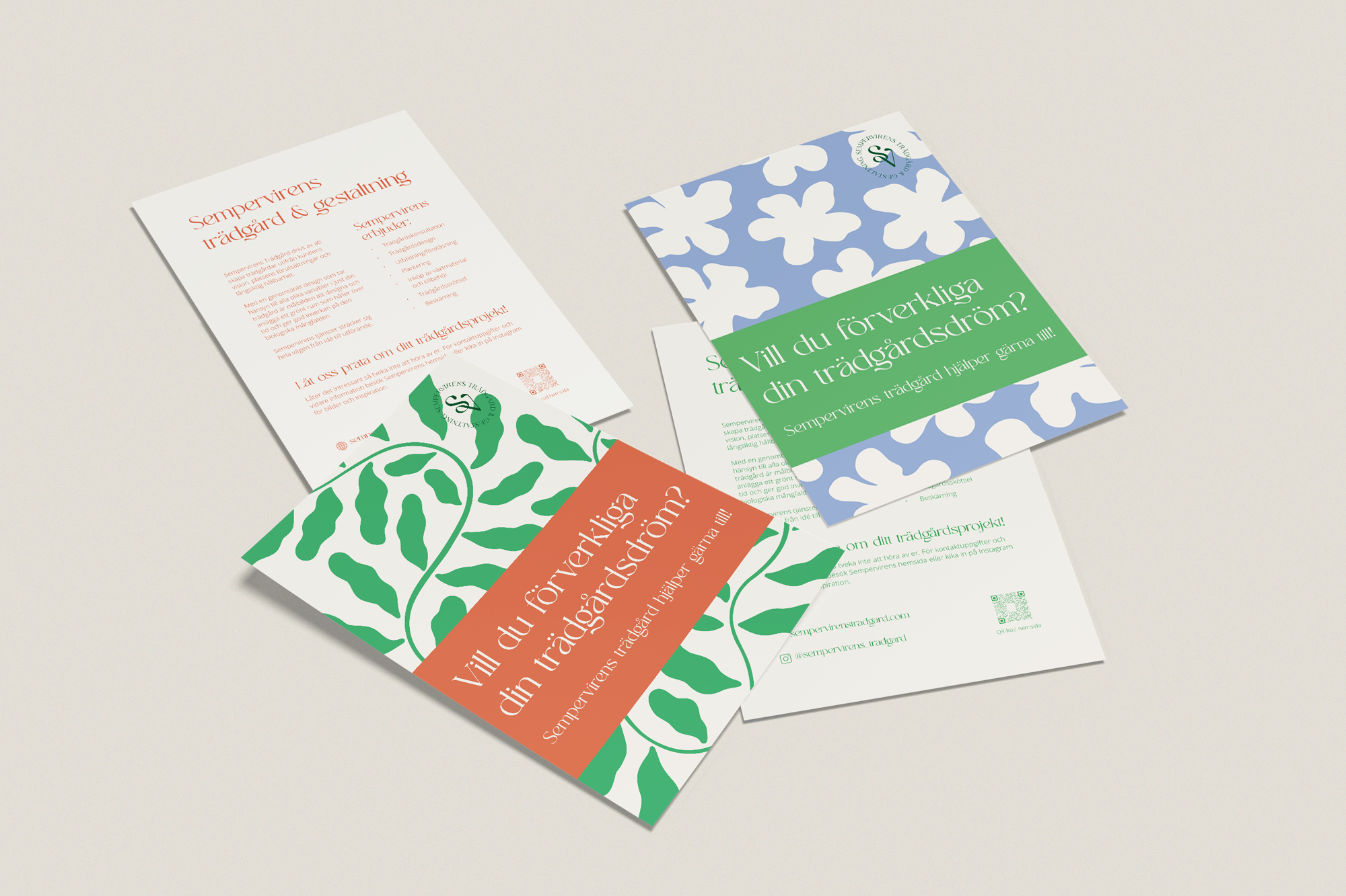
Each printed piece was crafted to reflect the carefully developed brand identity ensuring an equally captivating and professional appearance across all of the company’s touchpoints. The flyers feature a colourful, modern design that highlights the company’s services and values, while the business cards provide a memorable first impression with a sophisticated look and high-quality finish.
